Dutchess
Branding & Packaging
Dutchess is a brand of Menstrual Cups sold on Amazon that was looking to target the younger demographic that is more open to buying and trying Menstrual Cups, and is more considerate of their environmental impact.
The logo, coloring, and overall branding leans heavily into the Instagram influencer look and feel. Vibrant sunset inspired gradients, transparent banners and titles, and thing weighted illustrations help give the brand a luxe look and feel.


The branding was carried over into detailed care and use instructions as well. The majority of our customers are first time Menstrual Cup users, and so having clear and concise graphic illustrations for a user guide was a necessity.
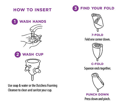
Limiting the copy as much as possible and relying on the graphics to communicate made the process of trying Menstrual Cups less intimidating to new users.
CONCEPTS
We explored a multitude of concepts, but the 2 shown below were the concepts we initially presented. The name "Dutchess" denotes royalty, but there is a strong pushback against the "elite" and this very narrow minded frame of what women should be and look like.
By ignoring and essentially dismissing the royalty aspect we came up with 2 concepts we felt extremely excited about. The first being a Blondie, Sex Pistols inspired "God Save the Queen" rebellious punk inspired look and feel. The second also still leaning into the counter culture rebellious nature, but taken a more activist approach and less anarchy.


original branding
The original branding did not give customers a sense of security or professionalism that someone would want when purchasing and using a medical device. It looked incredibly generic and had no resemblance to branded element at all.
.png)