Delmonte
Branding & Packaging
Del Monte is a fairly recognizable brand when it comes to canned foods, but its pickle line tends to get lost on the shelf. Gedney Foods acquired Del Monte Pickles and tasked me with coming up with concepts for Del Monte. I wanted to respect the rich 100 year history of the company by creating a classic vintage look that harks back to their original packaging while still being modern. The red base helps ground the label while creating a vibrant backdrop for the product iconography.


I made the product call outs large to stand out on shelf and make it easy for consumers. Water color inspired product icons are used to tie back to the original packaging as well.


I was heavily inspired by the Del Monte packaging that was used in the 1920's. The use of San Serif fonts, the simplicity of the layout and tying back in the gold elements with the gold line break at the center of the label.
.png)
original packaging
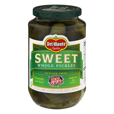
The original packaging for Del Monte had not been updated till the early 90's. It was a major reason why I pushed to explore rebranding efforts. The Del Monte name and logo is incredibly recognizable to people on the West Coast, but the current packaging was doing nothing to convert customers over to Del Monte pickles.
The overwhelming use of green makes the product get lost on shelf, and does not highlight the pickles. By increasing the amount of white on the label we increased the contrast on shelf and helped the pickles stand out more.